Chapter 5 Results
5.1 Covid Development in U.S.
5.1.1 Cases Trend Line
The spread of covid was extremely fast such that people’s lives were significantly impacted all over the nation. The cumulative Covid cases in U.S. have currently surpassed 40 million. The first two plots will demonstrate how Covid has been developing since the time it started.
5.1.1.1 Cumulative Total Cases
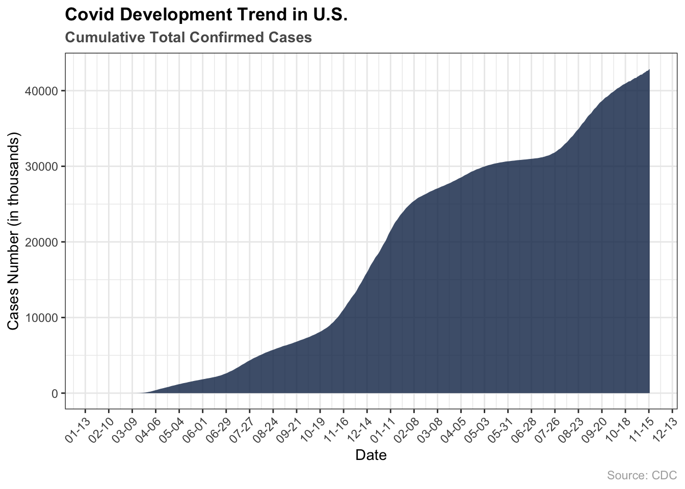
Covid started in March 2020 and reaches highest increase rate during winter 2020. In the first half of the year, covid cases number had surged to 5 million from 0, and it further increased to 25 million in the next half year. The increase of Covid cases was in an exponential rate as people went outdoors more frequently to socialize since the spread of the coronavirus also posseseses ‘Network Effect’.
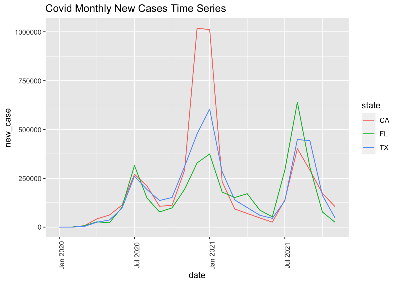
5.1.1.2 Daily New Cases
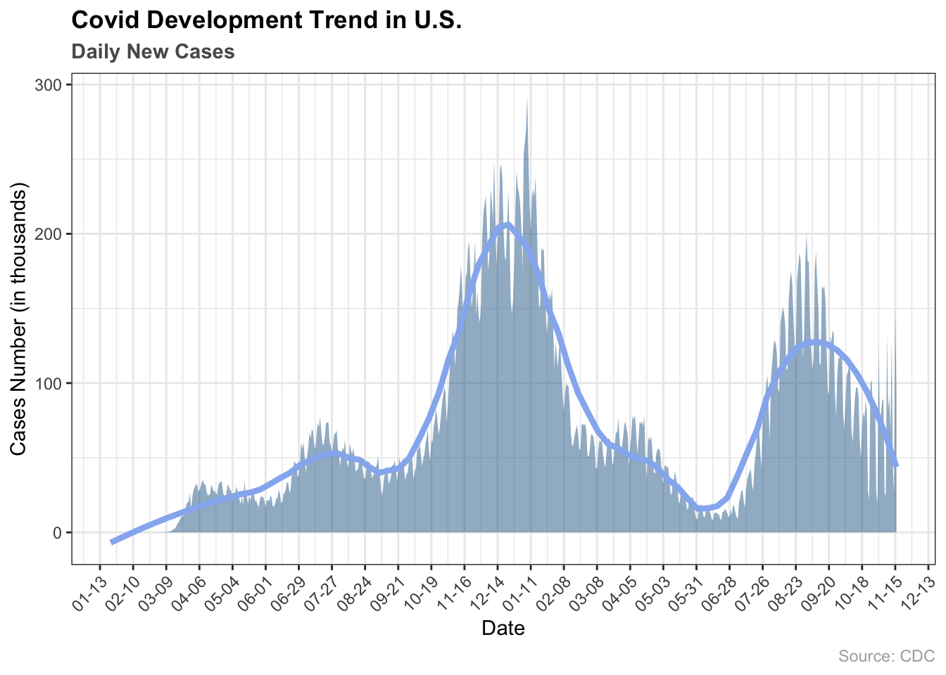
The daily new cases plot further justified what we mentioned above. The winter holiday in 2020 created an opening for facilitation of the spread of the virus in the United States, where the cold weather also enabled the Virus to live longer in the environment. In contrast, with the aid of a warmer weather, promoting and limiting social activities afterwards played a vital role in the obstruction of the spread during summer 2021, where we can observe that numbers of new cases are a lot less.
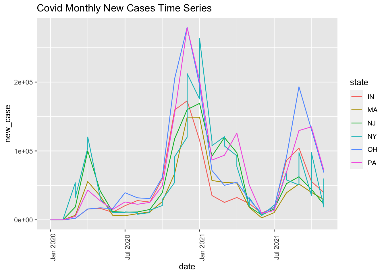
5.2 Covid Development in Different States
Here we compared how new cases and total cases change from 1976 to 2020 by state so as to see how Covid development differs in different location.
Instructions to use the graph:
Play/pause clicking the play/pause button
Navigate the motion slider by dragging the slider thumb
Navigate the motion slider by hitting the left and right arrow keys.
From the motion map, we can see that the first five cases in the United States come from Illinois, Washington and Arizona. At the beginning, California and New York have the highest number of new cases, which are two of the largest states that have the most population. From Jun 2020 to Sep 2020, it turned out that California, Texas and Florida continuously had the highest number new cases, followed by New York in a later period. A reasonable explanation is that population for these states are sufficiently large to enable the efficient spread of Coronavirus virus, especially if the restrictions are not rigorous enough.
From the motion map, we can observe that New York is the state with the largest total cases in the beginning and then from Jul 2020 until Nov 2021, California, Texas and Floria are the three States that have the largest total cases which is consistent with the trend of new cases from the previous motion map. Again, these are states with large populations and decent weather acts like a catalyst for the virus to live and spread even more rapidly.
5.3 Clustering States by Covid Trend
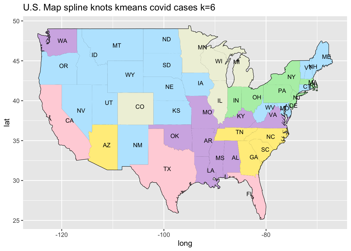
To identify difference and similarities between Covid case curves, we estimated a basis spline (B-spline) model for every state. Each estimated B-spline is a weighted piecewise combination of 10 polynomials, connected at the “knots”. The estimated splines in terms of their weight coefficients are closely related in states with similar underlying case curves. We compared the estimated state splines by using the K-means algorithm(We set k = 6) to cluster similar sets of weight coefficients, identifying groups of states with similar Covid case trajectories. In general, we can observe that the coefficients for two states in the same cluster are more similar than those in a different cluster(e.g. Florida and Texas). (Relevant link: https://towardsdatascience.com/using-b-splines-and-k-means-to-cluster-time-series-16468f588ea6)
The plotted trend line further accentuated that the clustering model is a reasonable method to group the cases curves across all states. For instance, California, Florida and Texas are grouped, which is consistent with the observation from interactive US map above. Those states are in the southern area of America, implying that a warmer weather that provides a fit environment for the virus to boost its longevity and activity.
5.4 Consumer Price Index Development
We utilized chained consumer price index to reflect the change in our living expenses. We aim to find the item that had highest increase in price after the covid breakout. We will also analyse their similarities with covid case patterns.
5.4.1 Chang of Living Expenses by Items
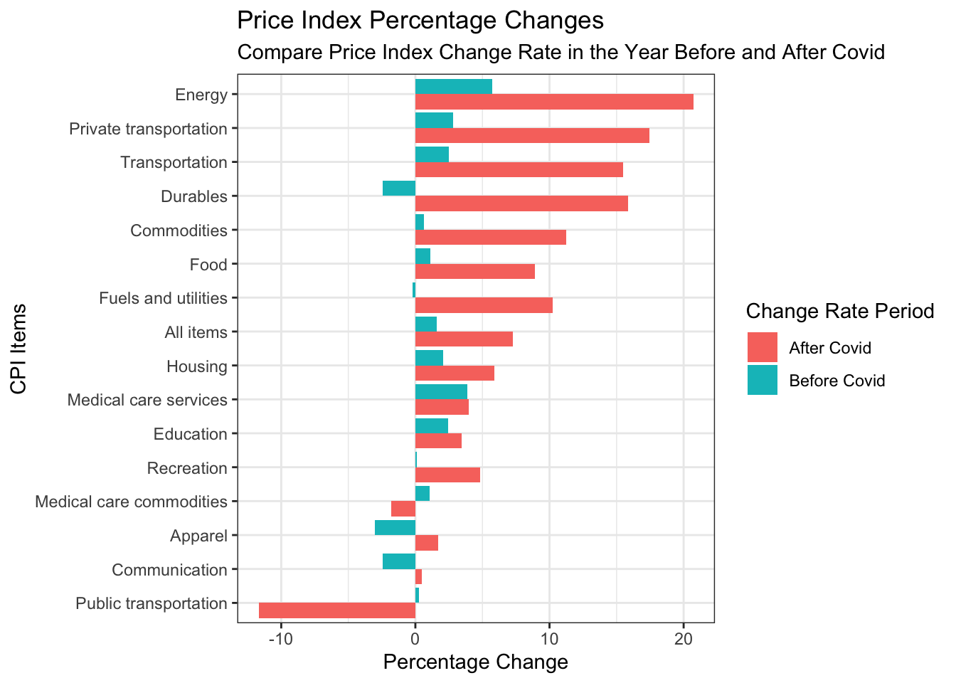
From the bar plot, we can see that public transportation is the only one that decreases the CPI after the Covid-19. Because of the Covid-19, many people avoided using pubilic transportation which is crowded. The decrease of demands decreased the CPI. In the opposite, private transportation, Energy and transportation CPI increases a lot after the Covid-19 comparing with the change rates before the Covid-19. More people choose to use private transportation to reduce the chance of exposure to the crowds. We already know that energy is a necessity for private transportation. The increase of demands on these three products increases the CPI at the same time. Durable goods is the one that has negative change in CPI before the Covid-19 and then increases sharply after the Covid-19. We know that during the Covid-19, people are forced to stay at home and this may be the reason that people bought lots of durable goods as they spent less outdoor. Moreover, the increase in Energy led to the manufacturing and transportation cost to increase which leads to a higher price of goods in the store.
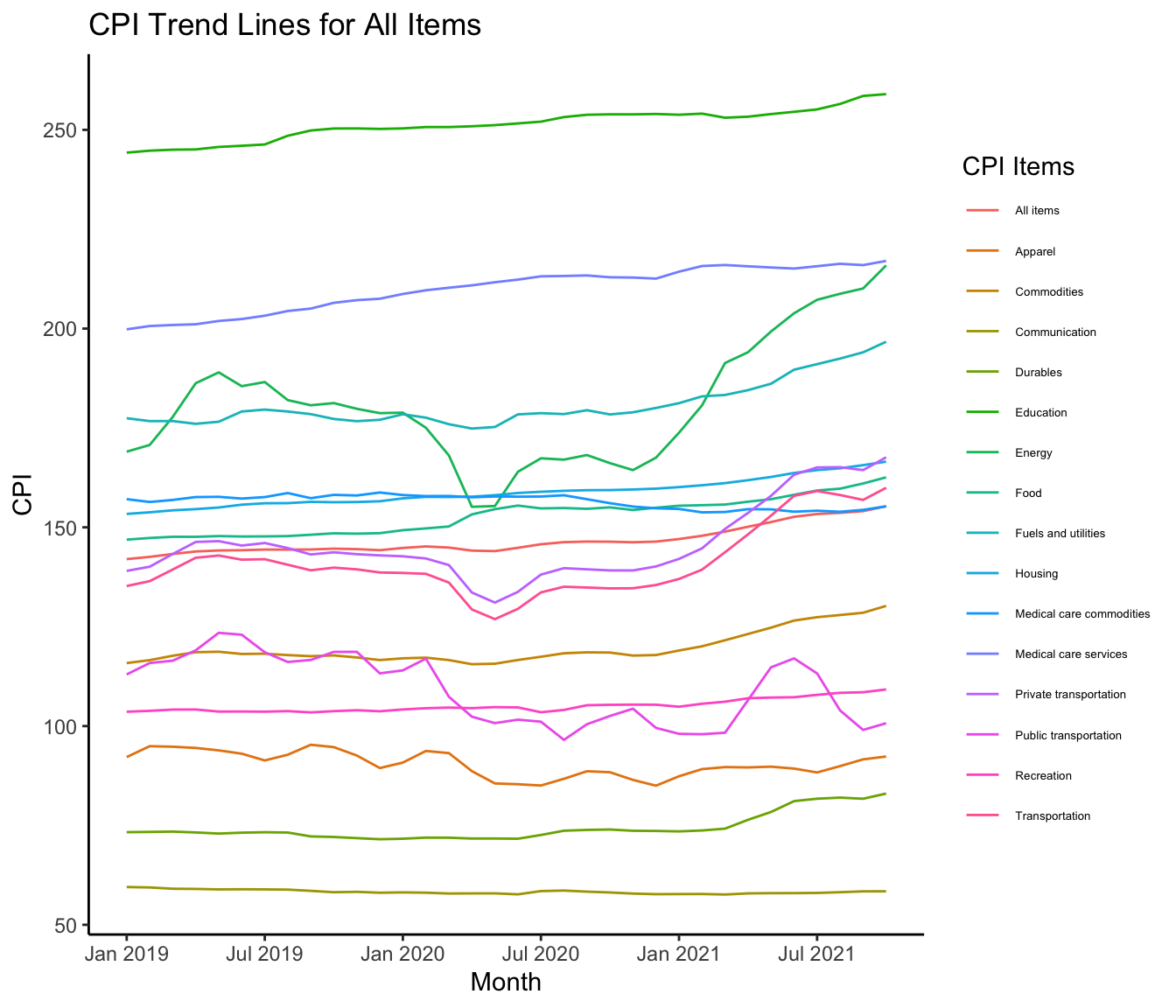
5.4.2 All Items’ Price Trend
Here we put all CPI items together for display so that we can know how the trend look like. The graph visualization is not idea and may not be informative. We will solve the problem and apply scaling, grouping, and correlation analysis on those data so as to draw useful insights and clear graphs.
5.4.3 Correlation Between Consumer Items
From the first graph with all CPI items, it is hard for us to tell clearly how each one moves. And by their names and our common sense, it is very likely that some of them share similar trend. Therefore, we decided to use a heat map to represent their correlations so that we can evaluate their similarities quantitatively. Our purpose here is to find similarities and group similar ones so that we can find the main cause of higher prices easier.
According to the heat map, we can easily tell that many of the CPI items are highly and positively correlated with each other. However, Public Transportation, Medical Care Commodities, Communication, and Apparel showed white and red color in the heat map. This indicates that they are not or negatively correlated with other items. Combining with the trend graph, I know that their prices did not increase much. It is also reasonable because some of them have pricing mechanism that is not determined by the market. For instance, Public Transportation, Medical Care Commodities and Communication have government set prices and fixed prices.
Energy are highly correlated with some other industrial and transportation related items. According to the heatmap, I would group the following items together: Energy, Commodities, Transportation, Private Transportation, Durables and Fuel and Utilities.
The rest of items are Food, Education, Housing, Medical Care Services and Recreation. Their correlation are higher than 0.8 indicating a high correlation between them. Their prices are highly affected by labor cost in services area. Since our living expenses increased, people working at services industry would need higher salaries and results in higher price for services. Moreover, their correlation with Energy is relatively low. Just like I explained before, it would take time to have effect on those prices. People would first feel the living expense to increase before they ask for higher salary. The delaying effect caused the correlation between them and Energy to be low.
Therefore, we grouped similar CPI items together and will show their similarities in the next part.
5.4.4 Group CPI Items
The groups we created for CPI items are as follows:
1. Price Stable Items: Public Transportation, Medical Care Commodities, Communication, and Apparel
2. Energy Related Items: Energy, Commodities, Transportation, Private Transportation, Durables and Fuel and Utilities
3. Labor Related Goods: Food, Education, Housing, Medical Care Services and Recreation
In order to confirm their similarities, their trend lines are plotted together below. Since their base values are different, the difference in scale would cause some trends not as obvious as others with larger scale. The standardized method is used here to showcase the similarities better.
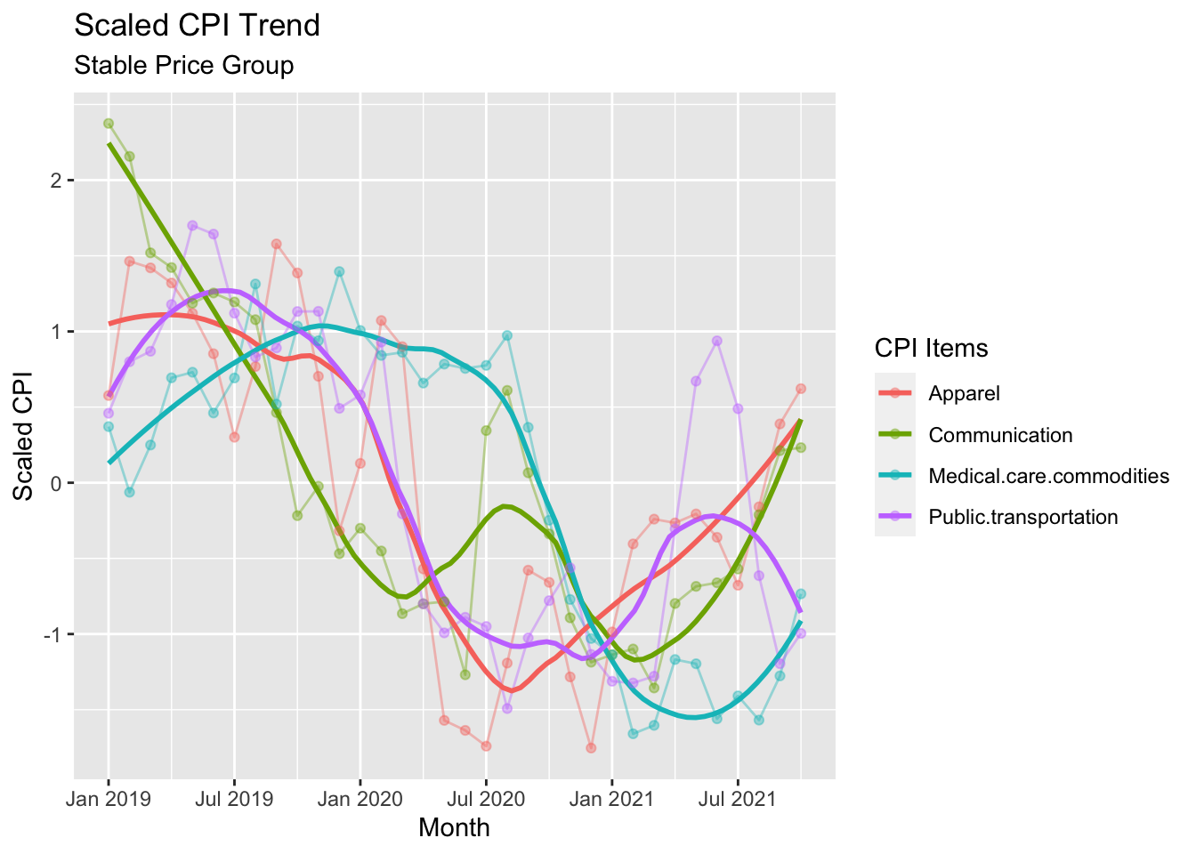
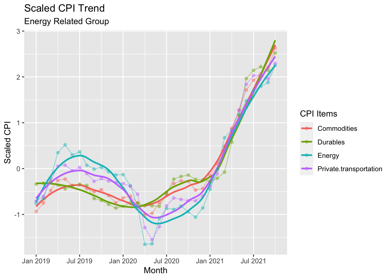
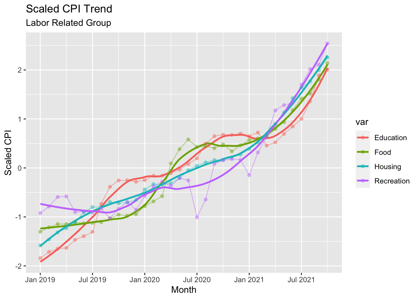
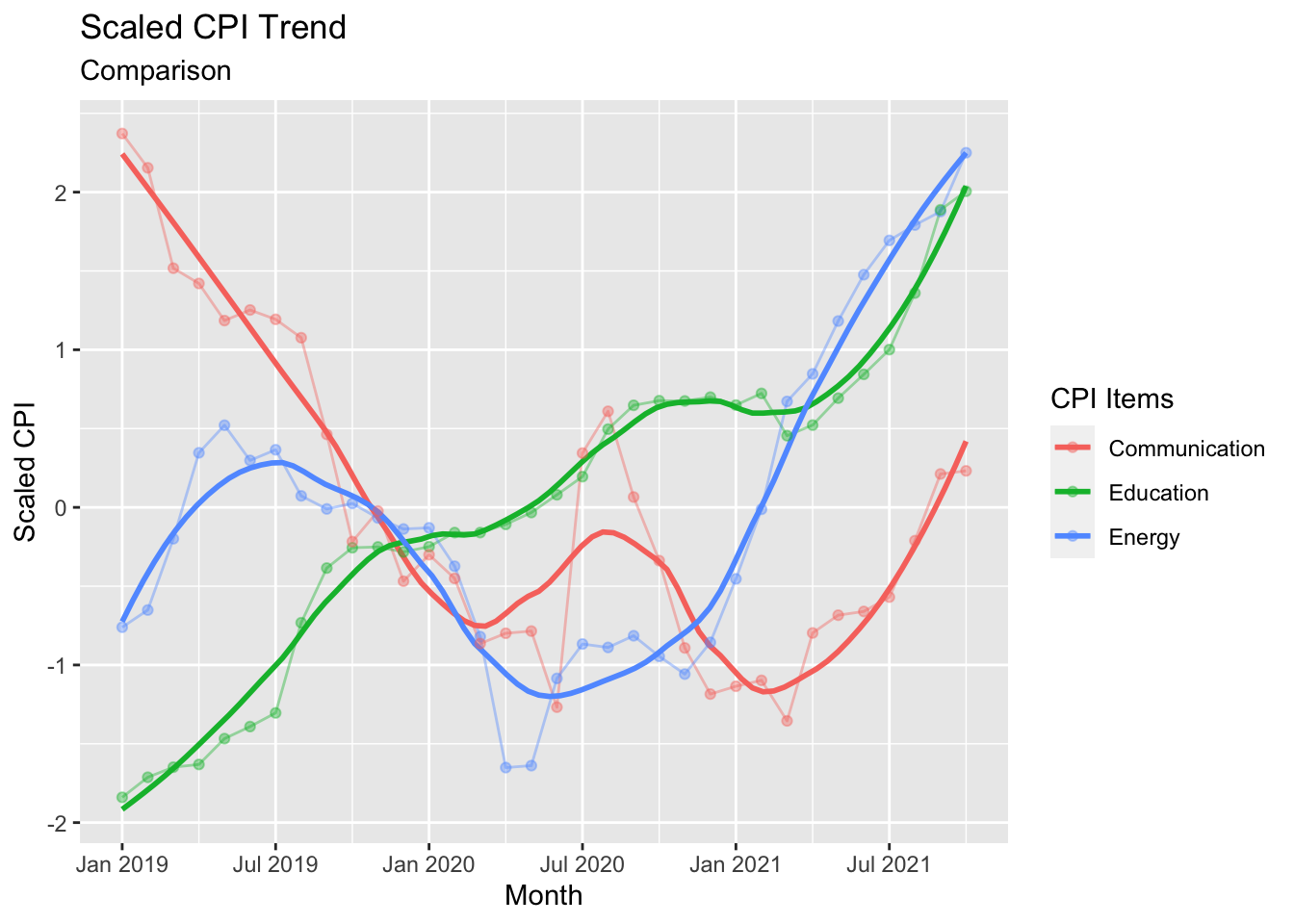
From the scaled trend lines, it proves that our grouping did a pretty good job! Price Stable Items had price drop since early 2019 and started to rise in price after mid 2020. Energy Related Items had a increase trend in early 2019 and had a huge drop after Covid broke out and increase in price afterwards dramatically. Labor Related Items had a general increasing trend since 2019, and had a higher slop after Covid broke out. The last graph showed one item from each of three groups to showcase their difference in trend as response to the Covid development.
According to the trends of different groups, Energy Related Items are more interesting to us. Their price dropped a lot after Covid just broke out. And then, the price increased dramatically after the first several months. Other goods, doesn’t seem to have such big impact from Covid. Therefore, we think Energy Related Items will be the target we will further investigate so as to discover how Covid caused our living expense to increase.
5.5 Covid’s Impact on Energy Price Index
5.5.1 Covid & Energy Trend Comparison
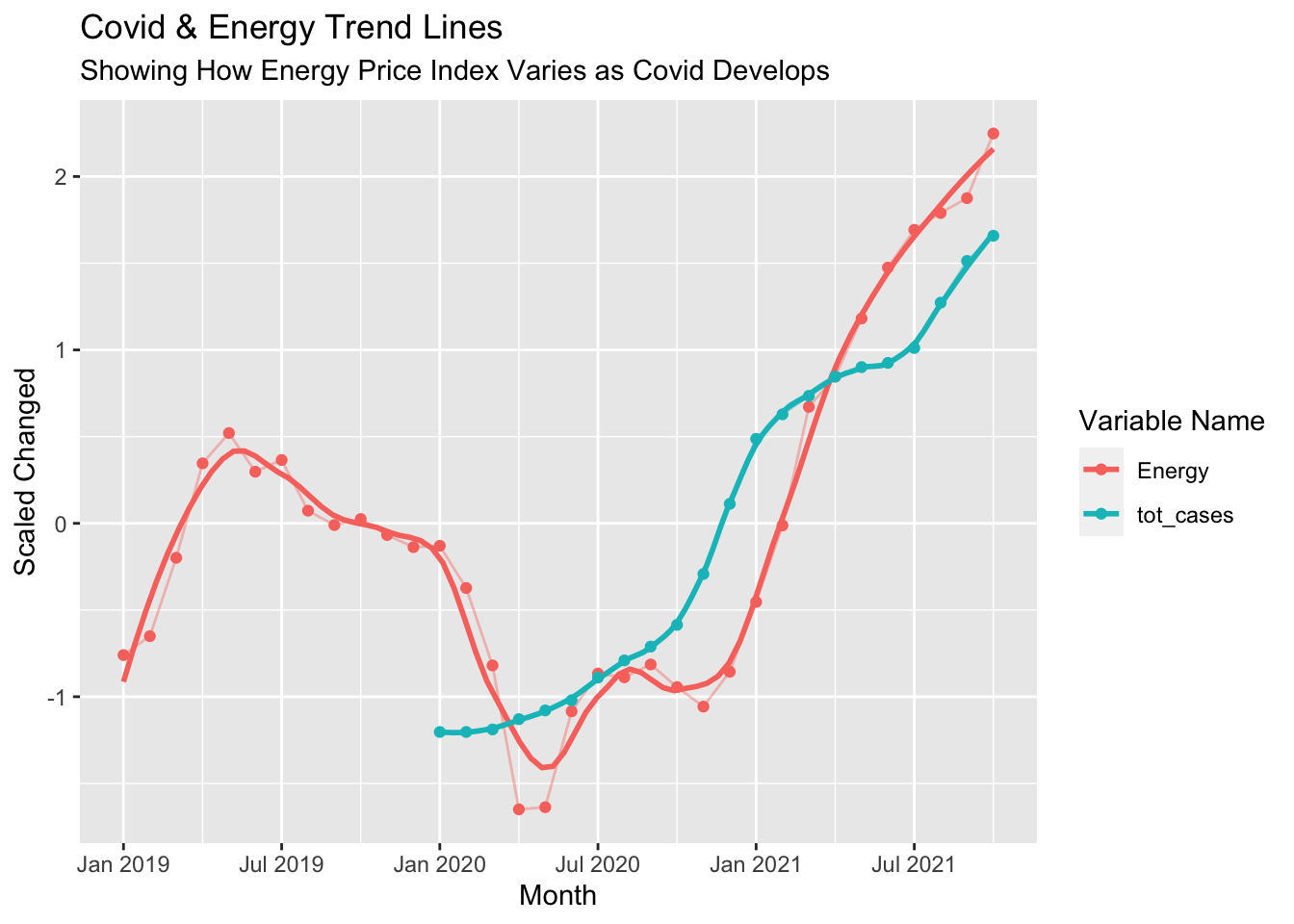
We have scaled the data so as to make their changes obvious and comparable. At beginning of 2020, Energy started to drop from 0 which is its mean to over -1.5 times its standard deviation. At the end of 2020, though Total Cases was still growing, Energy price started to recover and increase to higher level than before Covid broke out.
5.5.2 Change of Energy Price Index
Next, we are going to investigate the probable reason that Covid could cause Energy price to change like what we discovered. We would discuss the cause from supply perspective and demand perspective.
5.5.2.1 Demand Side Analysis
Before the Covid-19, the travel number increase steadily until February 2020. At the begining of the Covid-19 spread out, from February 2020 to April 2020, the travel decreases sharply which follows the tread that CPI for energy decreases sharply from Jan 2020 to March 2020, and then CPI for energy rises a little in July 2020, stay until Dec 2020, and a slight decrease in Dec 2020. From the travel trend plot, we can also see that the travel number has a slow increase from April 2020 to February 2021. The CPI for energy and air travel number both increase from Jan 2021 until now.
Travel takes large porpotion of energy consumption. As the travel needs decrease, the demand to the energy decreased at the early 2020. The increase in travel in late 2020 and 2021 lead to the increase in energy demand. Thus, stimulates the Energy price to increase.
It is clear that people stop traveling and working from home at the early stage of Covid broke out. This lead to a huge decrease in number of travel passengers number. In later 2020, the number of travellers is 1/3 of the number in early 2020. People starts to go back to office and go on vacation in summer 2021 as the new cases number starts to drop and people can not stand the lives staying at home everyday any more.
5.5.2.2 Supply Side Analysis
From the above line chart, we can see that before the covid-19, the supply of oil increases steadily. At the beginning of Covid broke out, from Mar 2020 to May 2020, the oil production decreases sharply which shares the same trend with travel number. The decrease of needs for travel leads to the decrease of needs for energy, results in the decrease of energy price and finally cause the decrease of supply. Then the production increases slowly to a relatively steady level. From the CPI of Energy plot and the travel number plot, we can see that both of them increases from Jan 2021 until now.
The increase of needs for travel increases the demand for energy. The extra needs for energy and the shortage of energy production together make the energy price index surges.